Research
Compare investment platforms and identify opportunities for the experience.
 Vidhisha Kedia
APEITA · PUBLIC SECTOR
My UX design work for Andhra Pradesh’s IT and electronics investment platform.
THE BRIEF
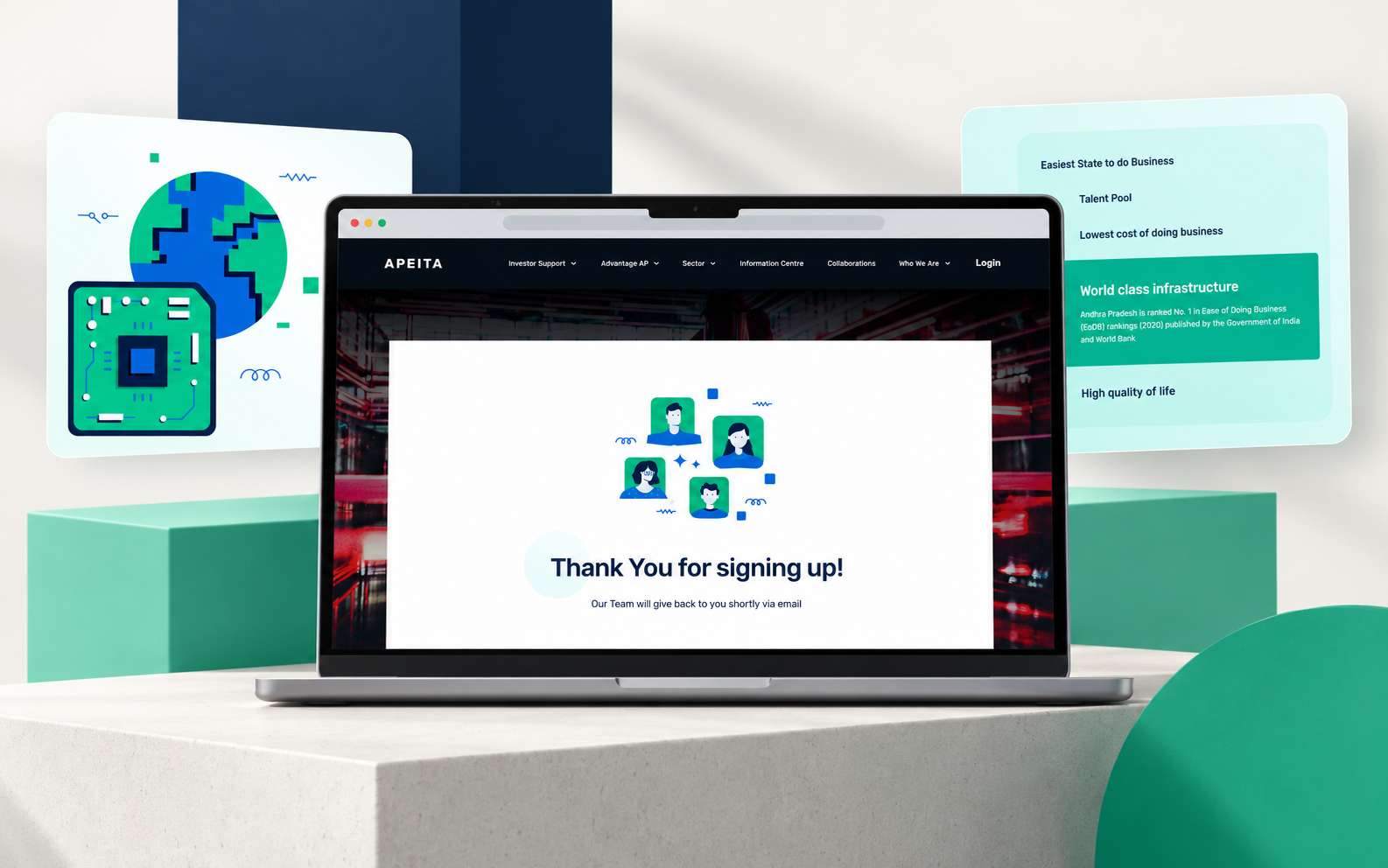
APEITA’s website needed to promote Andhra Pradesh’s IT and electronics ecosystem, business friendly policies, resources and incentives. Its audience included global organizations, business leaders and potential investors considering where to establish or expand their businesses.
The UX challenge was to organize this information around the investor’s decision: understand the state’s offer, evaluate the opportunities, find credible evidence and reach the right support.
MY CONTRIBUTION
As the UX Designer on this project, I worked on competitive analysis, investor personas, information architecture and homepage wireframes. These deliverables connected the business brief to the content and navigation a prospective investor would need.
Compare investment platforms and identify opportunities for the experience.
Define investor needs, goals, frustrations and expectations through personas.
Organize the site and translate the hierarchy into navigation and homepage wireframes.
RESEARCH
The competitive analysis began with ten national and international investment platforms. Six were selected for detailed review: Invest India, Invest Punjab, Guidance Tamil Nadu, Invest in Dubai, Invest Korea and EDB Singapore.
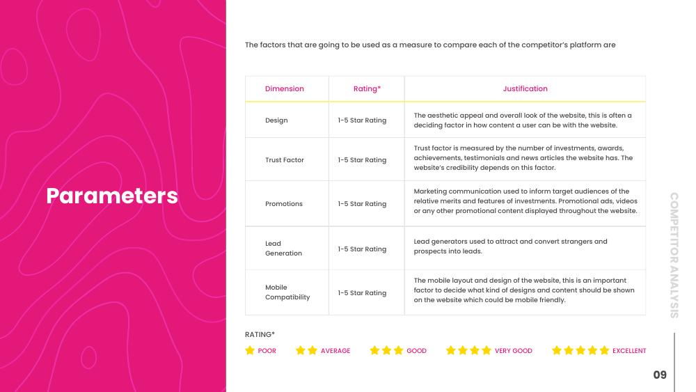
I compared them across five dimensions: design, trust, promotion, lead generation and mobile compatibility, to identify strengths, friction and possible directions for APEITA.
RESEARCH INSIGHTS
The analysis highlighted landing pages with too much or too little information. APEITA needed a clear proposition supported by the right level of detail.
Success stories, testimonials, ecosystem information and news could help investors assess the organization’s credibility.
Relevant benefits, clear inquiry routes and a usable mobile experience needed to work together, rather than as isolated sections.
THE USERS
The persona work captured two different investment contexts: an established business leader looking to expand, and an entrepreneur seeking support for startup growth. Their needs helped prioritize opportunity, workforce, infrastructure, policies and credibility.

An experienced technology and design business leader looking for the right investment opportunities to expand his company.

A tech entrepreneur with an investment banking background who wants to grow his startup into a profitable organization.
PERSONAS TO UX PRIORITIES
Give sectors and investment opportunities clear routes, rather than making visitors search through general information.
Make infrastructure, talent, startup support, incentives and policies easy to find.
Surface success stories and credibility alongside an accessible contact or business setup route.
INFORMATION ARCHITECTURE
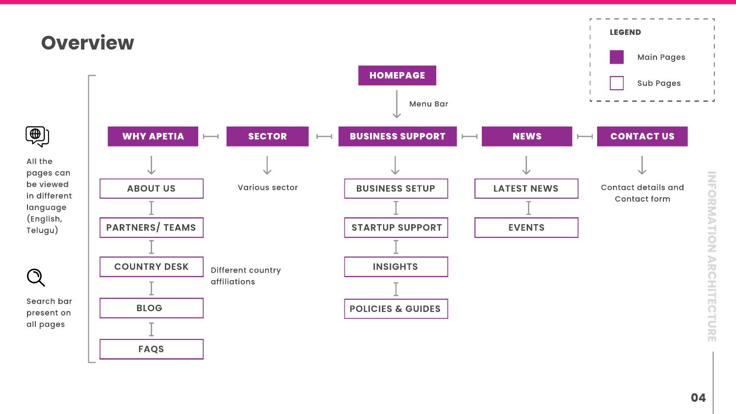
The site map grouped content into why APEITA, sectors, business support, news and contact. Supporting pages included organizational information, country desks, startup support, policies and guides.
The architecture also accounted for search across the site and English/Telugu language options. These helped make a broad content set more accessible without flattening it into one long page.
HOMEPAGE FLOW
The homepage structure introduced the investment proposition and state highlights, then explained APEITA and why Andhra Pradesh. Focus sectors and business support followed, with updates, testimonials, success stories and contact providing further evidence and a next step.
Proposition, state highlights and why Andhra Pradesh.
Focus sectors, resources and business support.
Updates, testimonials and success stories.
Registration, business setup or contact.
WIREFRAMES
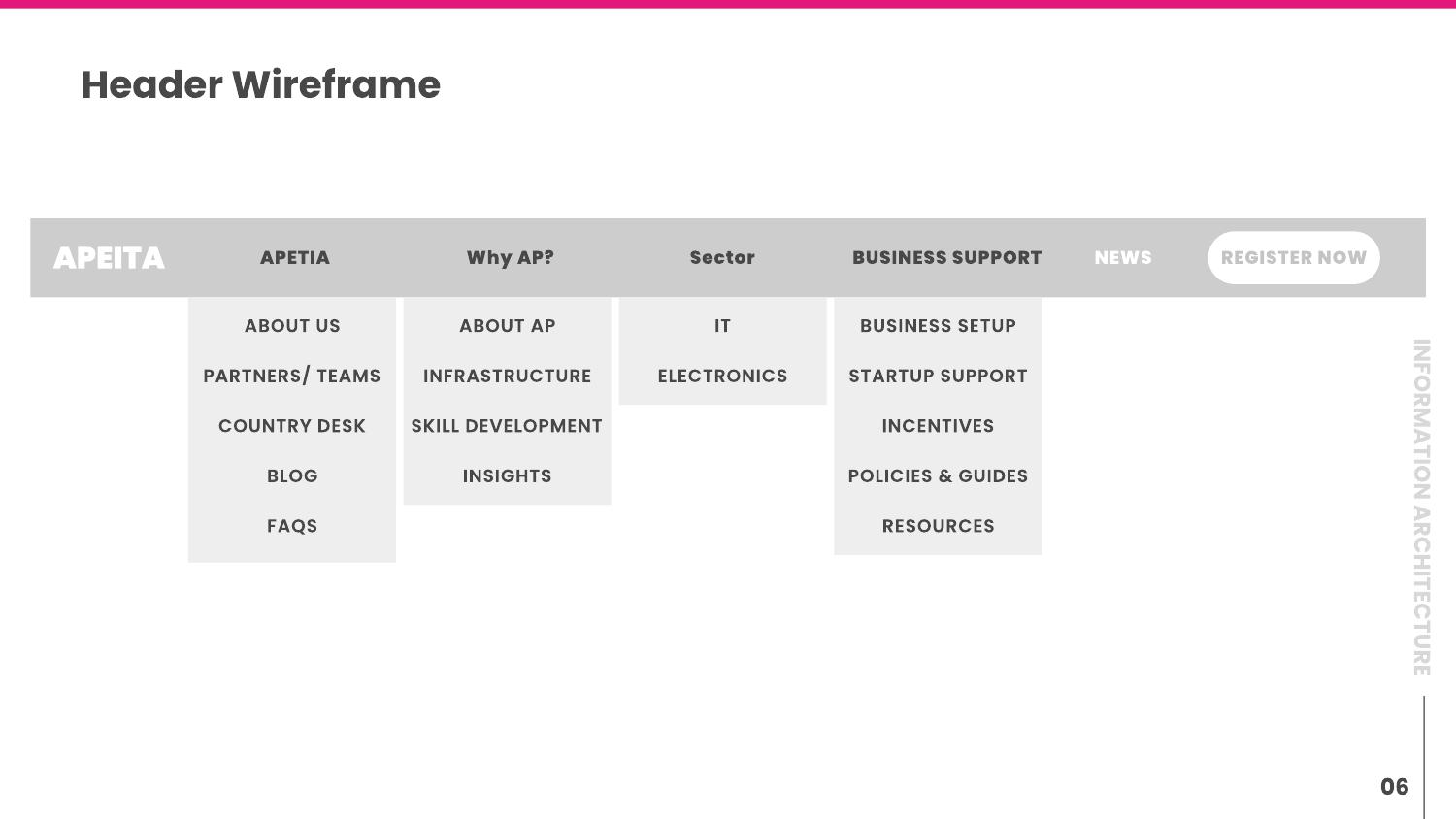
I translated the content structure into a header and a full homepage wireframe. The navigation exposed key information groups, while registration remained a visible action. The homepage balanced opportunity, supporting detail, credibility and contact.
WEBSITE WALKTHROUGH
The walkthrough shows the website’s scrolling experience, from the opening proposition through its information and support sections.
UX DELIVERY
The UX work resulted in a competitive analysis, two investor personas, a site map, navigation structure and homepage wireframes. Together, they defined who the site was for, what it needed to communicate and how its content should be organized.
The strength of the contribution was in connecting the decisions: the research highlighted the importance of clarity, credibility and inquiry; the personas made those needs specific; the architecture and wireframes gave them a place in the experience.
LEARNINGS
Comparing experience dimensions helped turn a broad brief into practical UX priorities.
Expansion and startup growth share a need for trust, but require different information and resources.
Policies, sectors and success stories become more valuable when they support a clear path through the decision.