Understand the users
Explore investment behaviour, decision making, information needs and expectations of financial platforms.
 Vidhisha Kedia
FINEZZY · FINTECH
A connected mobile and web experience for understanding investments and accessing credit against mutual fund holdings.
THE BRIEF
Finezzy brought portfolio information, financial guidance and access to credit into a digital experience. Its loan against mutual funds journey helped people explore borrowing against their holdings without redeeming those investments.
The design challenge was to make a complex service understandable: what users already owned, which options were available, what information they needed to provide, and what happened next.
MY CONTRIBUTION
I worked across user research, experience structure, interface design and UX content, collaborating with stakeholders and developers. My scope also included the brand identity, website and launch material, so the service could communicate consistently across touchpoints.
Explore investment behaviour, decision making, information needs and expectations of financial platforms.
Translate those needs into product flows, clear screen hierarchy and mobile interfaces.
Connect the brand, product language, website and visual communication.
USER RESEARCH
The research study included seven participants selected through a screener covering age, gender and current investments. One to one sessions ran from 26 February to 11 March and lasted 30 to 40 minutes.
I explored how people selected investments, which platforms they trusted, how they evaluated performance, and where they needed financial support. The study also examined competitor app interactions, navigation and ease of use.
Zoom recordings captured feedback and facial behaviour. We debriefed after sessions to align findings with the research objectives.
RESEARCH INSIGHTS
Participants felt frustrated by the lack of the right information for investment decisions.
Participants used Moneycontrol before investing. Familiar analysis helped them judge their options.
Participants were comfortable considering a premium service for financial support.
All seven regularly checked analysis and reports to understand fund performance. Borrowing to make investments was not part of their primary behaviour, and they showed no interest when prompted. This was distinct from accessing credit against existing holdings.
THE USER

Comfortable with numbers, Gaurav plans investments using spreadsheets. He invests across mutual funds, fixed deposits, equity shares and Bitcoin, and wants his decisions to support long term milestones.
Financial advisers have not matched his needs. Existing services do not clearly show how changes to his current plan affect future goals.
An easy to understand portal that connects his current goals, financial choices and future milestones.
RESEARCH TO DESIGN
Give portfolio summaries, performance and reports a clear hierarchy so people can evaluate their financial position.
Explain credit against existing assets without presenting borrowing to invest as the default user goal.
Use direct language and visible status through account creation, verification, selection and ongoing servicing.
USER FLOWS
BRAND & DESIGN SYSTEM
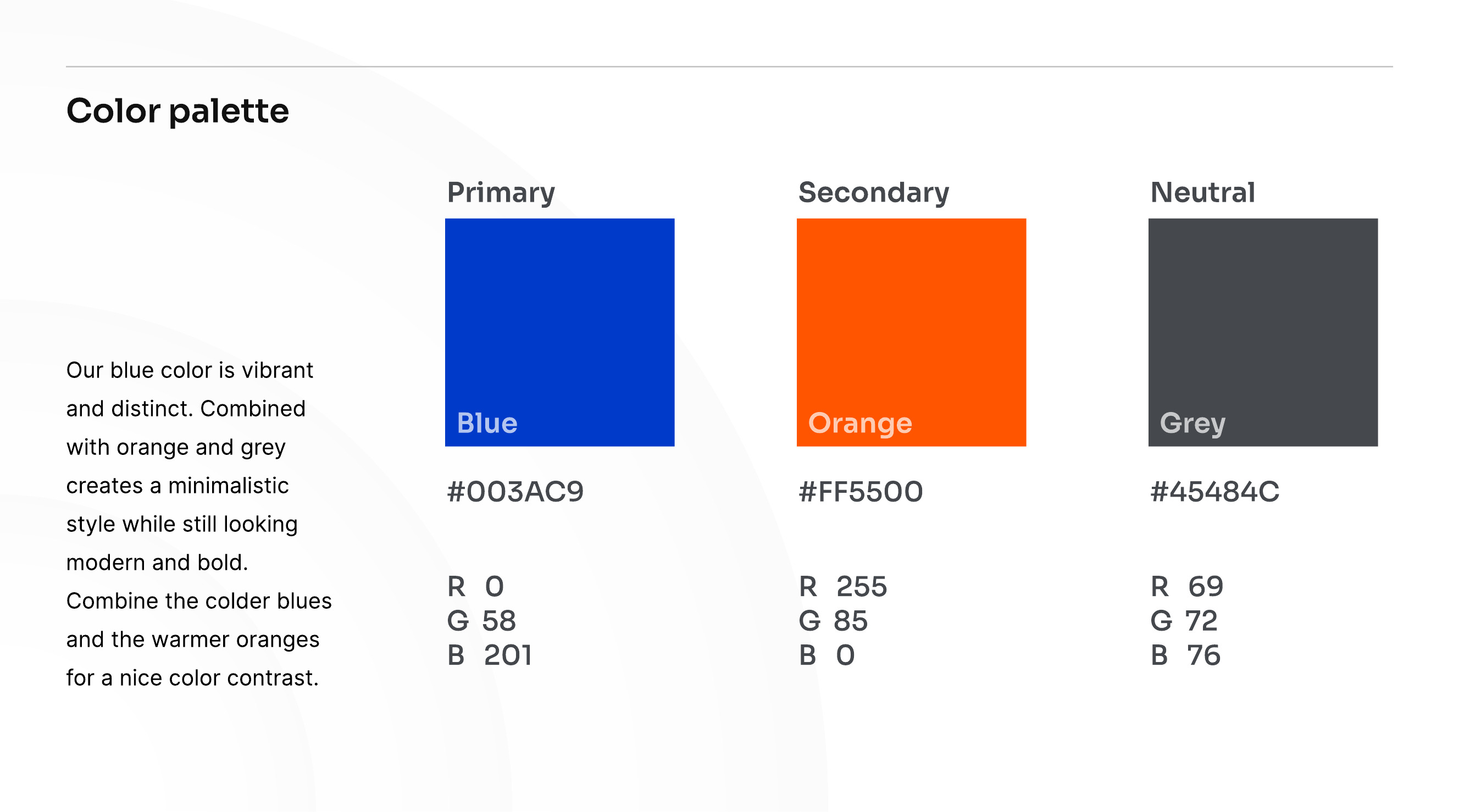
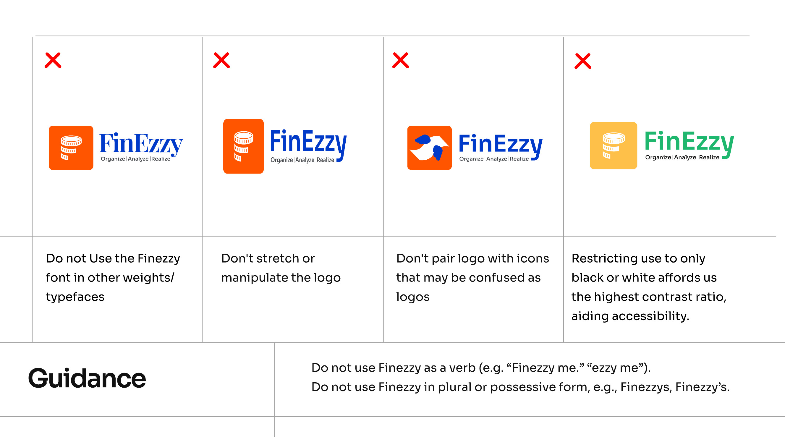
I established the visual foundation through logo applications, colour, typography and style guidelines. This gave the mobile experience, website and launch communication a shared identity.
PRODUCT DESIGN
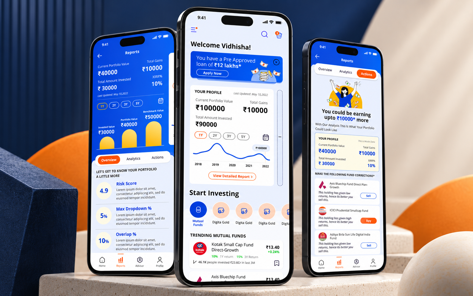
The opening experience introduced the service and set the tone for the account journey. I used clear hierarchy and approachable visual communication to explain the product before moving into financial information.


The dashboard brought key financial information together. The hierarchy helped users move from an overview to the details they needed, rather than treating every figure as equally important.
Portfolio reports and investment recommendations supported the return journey after onboarding.

PRODUCT WALKTHROUGH
WEBSITE EXPERIENCE
The website introduced the product, explained its value and supported the move into the app. My work connected content, layout and brand communication so the web experience felt like part of the same service.
DELIVERY
The work brought together research, product flows, mobile interfaces, UX content, brand guidelines, website design and launch material. The contribution was not one screen in isolation, but a consistent path through a complex financial service.
LEARNINGS
Participants’ lack of interest in borrowing to invest made it important to distinguish user behaviour from the broader business opportunity.
People wanted analysis they could trust. Visual polish could not replace a useful hierarchy and understandable language.
Brand identity, UX content and interface structure needed to work together across mobile, web and communication.
EXPLORE FINEZZY