Fragmented setup
Survey creation and execution happened in different dashboards. Audience generation needed to sit alongside campaign setup.
 Vidhisha Kedia
ADIMPRINTS · ENTERPRISE PLATFORM
Designing a unified dashboard for Zapr’s campaign, audience and reporting workflows.
THE BRIEF
Running a campaign meant moving between separate internal tools to build audiences, create surveys, set up campaigns and monitor results. Reporting and billing added further handoffs.
The brief was to bring these capabilities into Adimprints: one platform for campaign management, user management, surveys, segments, reporting, monitoring and billing. The challenge was to connect the work without overwhelming the people doing it.
MY CONTRIBUTION
I worked with engineering to understand constraints, product management to refine goals as the project evolved, and customer success to identify confusion. My contribution covered research, UX patterns, dashboard guidelines, prototypes and interface design.
I used the Double Diamond as a flexible guide: understand the work, define priorities, sketch and decide, then prototype and test. The process had to accommodate frequent additions to the workflow.
UNDERSTANDING THE WORK
I interviewed internal team members and used observation to understand needs, pain points and existing workarounds. The dashboard served two groups: internal teams managing operations, and clients accessing campaign information.
Survey creation and execution happened in different dashboards. Audience generation needed to sit alongside campaign setup.
Many sections needed clear navigation and easy switching. Preview and line item settings needed to be easier to find.
Campaign reports needed to be downloaded and shared easily. Finance needed campaign details and flexible billing exports.
THE USERS
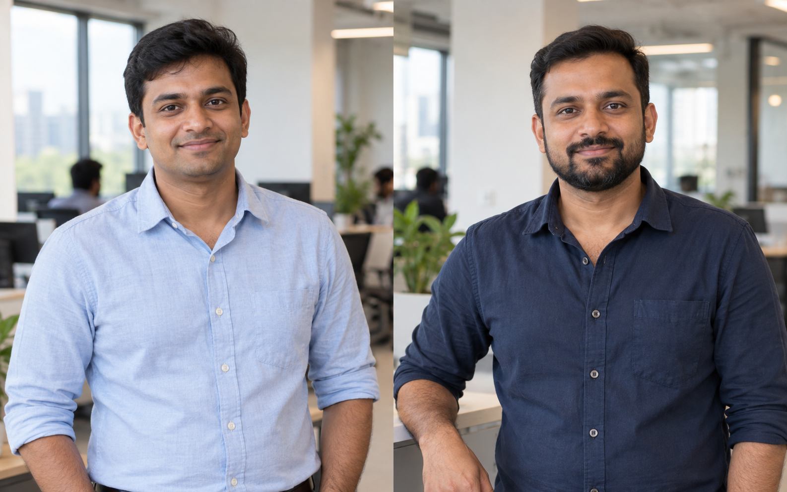
31 · Ad Operations Manager, QA
Bangalore · Male
Manish manages critical campaigns across regions and has a strong understanding of Zapr’s systems.
36 · AVP, Digital Advertising Operations
Bangalore · Male
Raj works on revenue analysis, product trends, business intelligence and planning for digital advertising operations.
DEFINING THE DIRECTION
The research shaped three priorities: keep related tasks together, make the platform’s hierarchy visible, and support handoffs between operations, clients and finance.
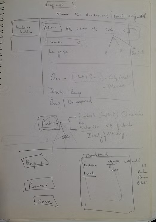
Audience creation belonged in the same workspace as campaign setup. Reporting needed to support individual campaigns, while billing needed flexible columns and exports. Different roles also needed different access to the platform.
EXPLORATION
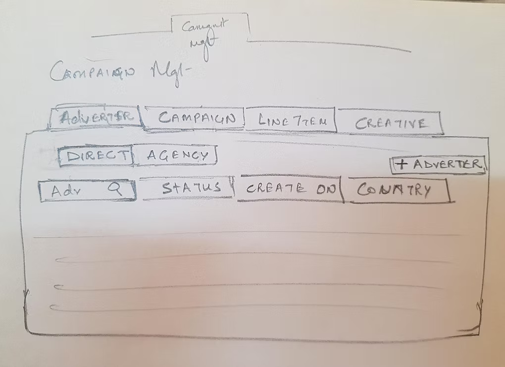
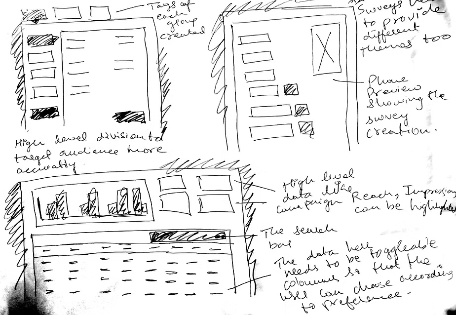
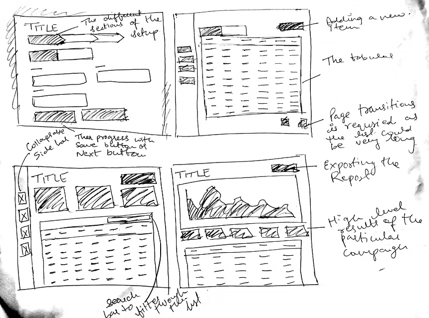
The flow changed as requirements grew. Sketching let me explore and revise the structure quickly before moving into higher fidelity designs.
INFORMATION ARCHITECTURE
I built the information architecture from interviews and observation. Campaign management connected advertisers, campaigns, line items and creatives; other modules supported surveys, audience segments, monitoring, billing and account permissions.
Advertiser / Agency → Campaign → Line item → Creative
Segment management · Survey management · Preview
Monitoring · Reporting · Billing · Account permissions · Help & support
USER FLOWS
WIREFRAMES
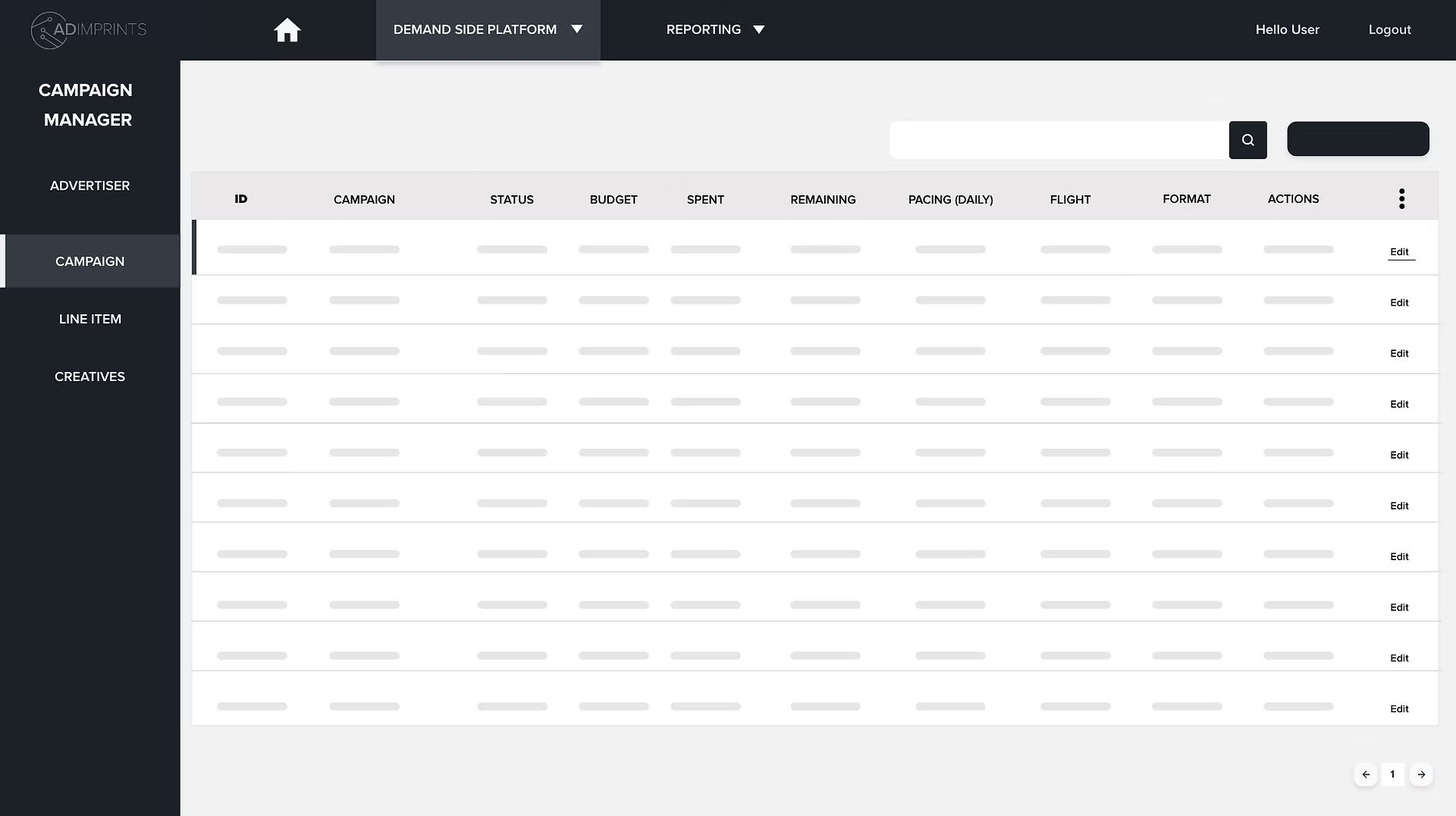
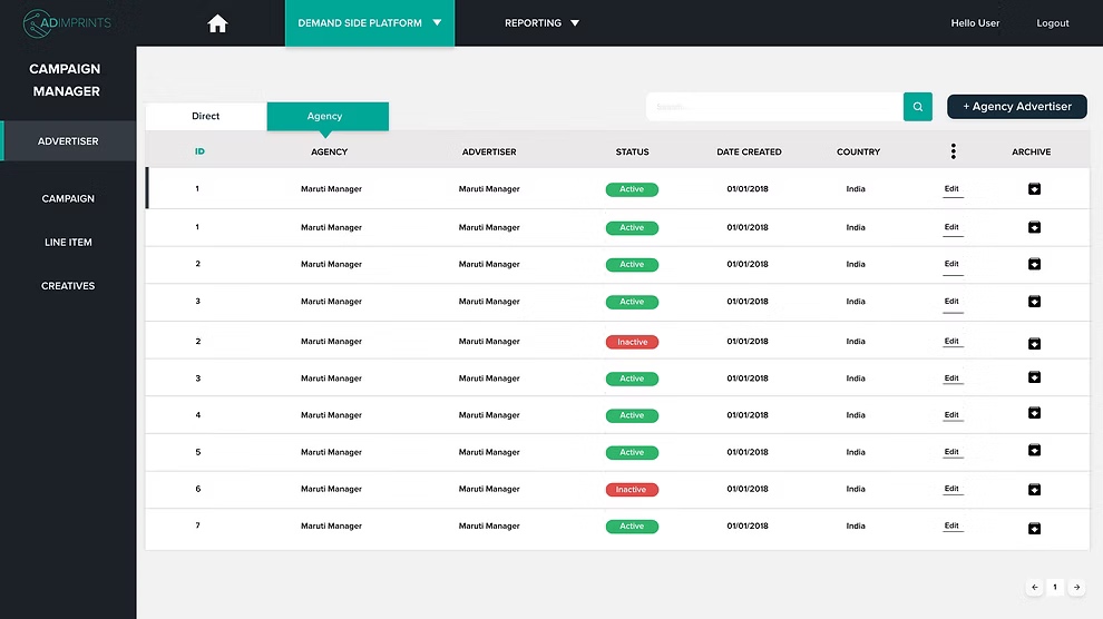
I moved from sketches to wireframes and Adobe XD prototypes, using Material UI as a framework. Tables became the core working surface, with navigation, setup steps and actions organized around each task.
TESTING & ITERATION
Usability testing revealed where the initial interface needed refinement. I returned to the designs to improve the experience before preparing the high fidelity prototype.
“The colors and icons used are very bold.”
Campaign names would be much longer than the space available.
Users needed an export option for each campaign.
“How do I change the settings of a line item?”
Users needed separate groups for shows, channels, genres and timings.
FINAL DESIGNS
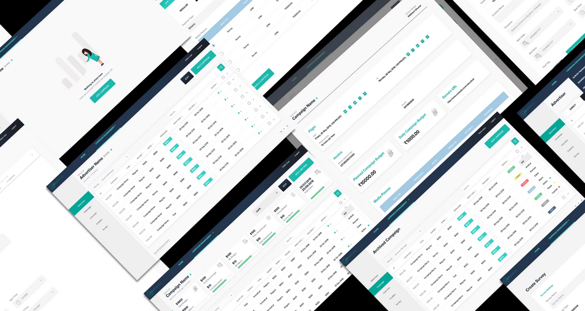
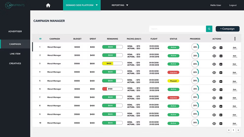
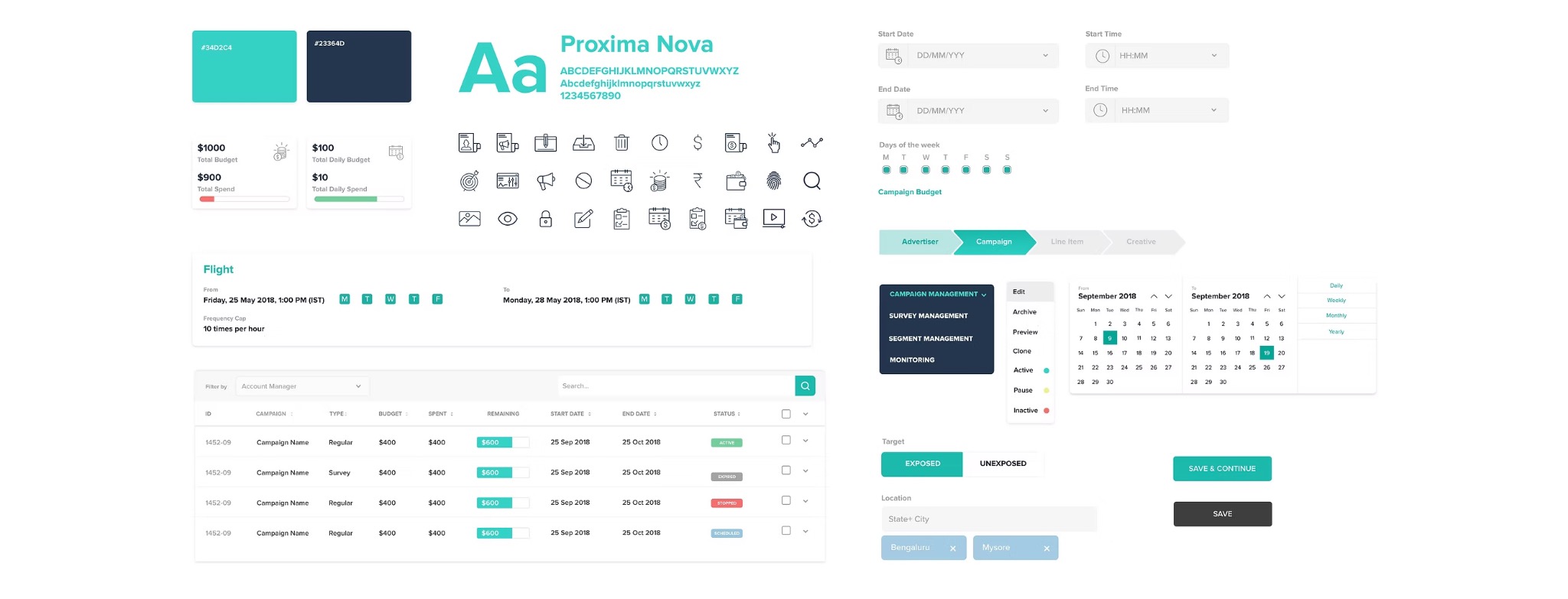
The final design brought campaign setup, audience creation and operational visibility into a shared interface. Teal actions, navy navigation and reusable controls helped connect the modules.
DELIVERY
I prepared a high fidelity prototype with animations to present the dashboard to the team and stakeholders. The work established a common design language and a connected model for the platform’s modules.
LEARNINGS
The design sprint helped uncover errors early. Testing made weaknesses visible and gave the next iteration a clearer direction.
Cross team communication affected the project timeline. Regular feedback and shared progress checks matter as much as interface decisions.
Sketching made changing requirements easier to handle and helped identify problems before investing in detailed screens.