Decision fatigue
Choosing a movie or show was tedious and ate into the time people wanted to spend watching.
 Vidhisha Kedia
DEKHO · ENTERTAINMENT DISCOVERY
Helping viewers find movies and shows they want to watch and know where to watch them.
THE BRIEF
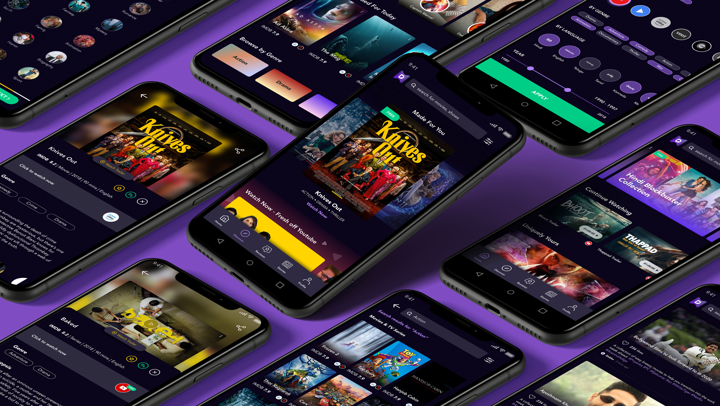
As video consumption grew in India, viewers had more platforms and more choices, but choosing what to watch could still be exhausting. Dekho brought personalized recommendations, reviews and streaming availability into one place, across providers including Netflix, Amazon Prime, Hotstar, Zee5 and YouTube.
My work connected an understanding of viewers’ behaviour to the app’s discovery experience: user research, synthesis, information architecture, wireframes and interface design, developed with the team.
THE PROBLEM
Choosing a movie or show was tedious and ate into the time people wanted to spend watching.
Finding a title across streaming platforms meant repeating the search.
Viewers wanted recommendations across genres and languages, not only more of their previous choices.
USER RESEARCH
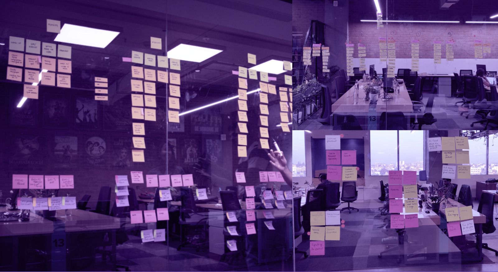
We interviewed 10 people, aged 20 to 40, who regularly streamed content across languages and platforms. The qualitative interviews lasted 20 minutes each, followed by time spent building user profiles. Participants included both men and women.
I explored what influenced viewing choices, how people found recommendations, how much time they spent searching, and the role of ratings, reviews and entertainment news.
A storytelling exercise asked people to walk through a typical day and explain how they had found and chosen the movie or show they were currently watching. This grounded the research in real behaviour.
INTERVIEW INSIGHTS
Of the interview participants, 70% spent an average of 30 minutes deciding what to watch.
Recommendations influenced viewing behaviour. Friends, family and word of mouth were the most important drivers.
Half did not pay for streaming apps. Sharing paid platform logins with friends or family was common.
THE USER
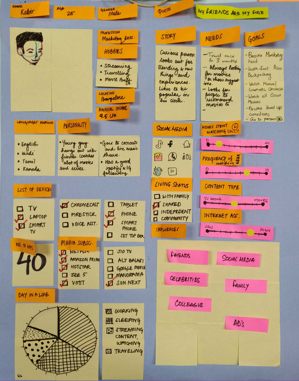
Enjoys streaming, travelling and meeting friends. Watches across multiple platforms and languages, and fits entertainment around a working day.
Watch the Marvel cinematic universe and Oscar winning movies, and discover new experiences with friends.
Friends, family and social media help shape what he watches.
COMPETITIVE ANALYSIS
We reviewed existing experiences including Mubi, IMDb, YouTube, Taste, MX Player and JustWatch. The opportunity was to connect recommendation quality, content information and access, rather than adding another place to browse.
DEFINE & IDEATE
We brainstormed and narrowed down the direction around personalized discovery. Ideas included a free movies section, seeing what friends were watching through social integration, and voice search.
Use preferences to find recommendations that fit viewers’ interests, while keeping room to explore.
Viewers noticed strong posters and “Free” tags. A dedicated section could make accessible content easier to find.
Bring trailers, ratings, reviews and provider information together so viewers can judge a title without leaving the experience.
INFORMATION ARCHITECTURE
The architecture organized the app into Homepage, Stories, Video Reviews, Free Movies and Profile. Content details connected discovery to trailers, synopses, IMDb ratings, cast, user ratings and similar recommendations.
Search · Recommendations · Genre & language tabs · Filters
Articles · Recommendations · Video reviews
Reviews of movies and shows
Collections · Search · Free recommendations · Genre tabs
Profile details · Ratings · Watchlist · Logout
Watch trailer · Rate content · Synopsis · IMDb rating · Cast · Similar recommendations
USER FLOW
WIREFRAMES
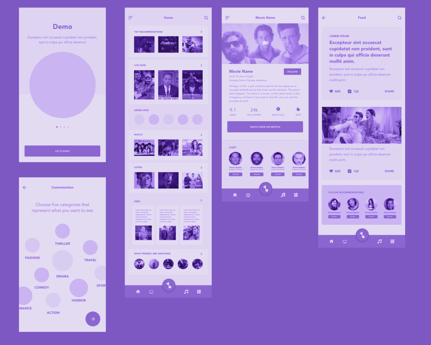
We mapped the screens needed to cover the main scenarios, then detailed the flows in wireframes. Onboarding, the homepage, movie details and the feed helped us work through how preference setting, discovery and evaluation would fit together.
INTERFACE DESIGN
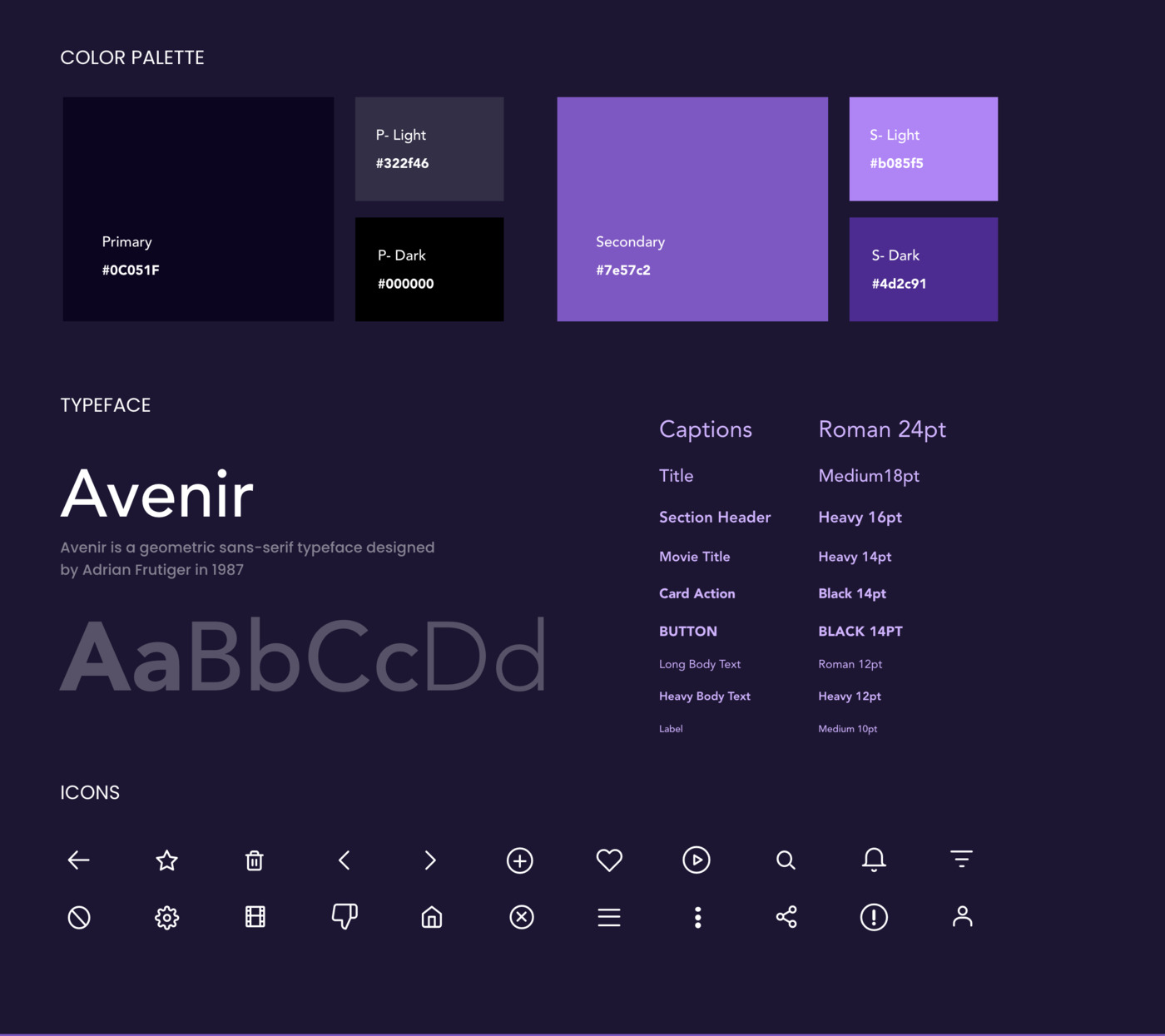
The app used a dark, poster led interface with purple accents. The style guide established a shared palette, Avenir typography, text hierarchy and icon set so discovery, content details and profile screens felt connected.
The design brought personalization, provider information, video reviews and free collections into the product. These features then needed to be tested against how viewers understood them.
USABILITY TESTING
A later usability study, conducted on 17 to 19 February 2020 with 10 participants, combined one to one interviews and task based testing. Sessions lasted 50 to 60 minutes, with screen and audio recordings, behavioural observation and a live observation room for the team.
We evaluated navigation, ease of use, acceptance, appeal and engagement alongside current viewing behaviour. This revealed where the interface’s meaning did not match people’s expectations.
Download usability test reportAll 10 expected the logo to take them home. The filter was mistaken for a side menu, and several icons were interpreted differently from their intended function.
Remove top navigation, keep bottom navigation, simplify the tutorial and revise icon meaning.
All 10 liked knowing which platform carried a title. Free content mattered, but needed clearer signals.
Add “FREE” tags throughout discovery and content details, and make free collections visible.
The landing screen felt busy, onboarding felt lengthy, and entertainment gossip and video reviews were not primary reasons to use the app.
Improve recommendations, simplify onboarding and rename Gossip to Stories with more approachable copy.
Seven of 10 did not use the three dot menu to remove a watchlist item. Many tried long pressing first.
Reconsider the watchlist icon and its position in the profile, and make item actions easier to understand.
PRODUCT WALKTHROUGH
OUTCOME
The team implemented changes to navigation, recommendation quality, tutorials, icons, free content visibility, section copy and Play Store content. The usability report recorded the app rating increasing from 3.1 to 3.5 within a week, alongside an 11.11% increase in installs within a week of the updates.
App rating reported after the updates
Installs reported within a week
LEARNINGS
The problem was not simply a lack of recommendations. Time, social influence and access all shaped the decision.
An icon or navigation pattern only works if people understand it. Testing exposed the gap between our intended interactions and viewers’ expectations.
More features do not necessarily make choosing easier. Reducing home screen clutter, shortening onboarding and widening research to lower income viewers remained important next steps.